A Data-Driven LEGO Explorer
Interactive visual exploration platform analyzing historical LEGO set pricing, piece counts, and theme progressions across decades.
01 Challenge & Context
LEGO enthusiasts and collectors struggled to evaluate investment value, piece-to-price ratios, and historical theme lifecycles from static catalogs.
02 Solution & Execution
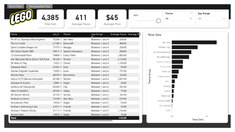
Extracted and transformed multi-decade catalog datasets using Python and Power Query, building dynamic scatter plots and theme distribution hierarchies.
Developed an intuitive price-per-piece efficiency matrix allowing users to spot exceptional value sets at a glance.
Trade-off: Price per piece makes comparison approachable but cannot represent rarity, condition, or resale value alone, so it is presented as an exploration aid rather than buying advice.
03 Impact & Learnings
Created an engaging, analytical playground that bridges playful curiosity with data science storytelling.
Interactive report showcased to data design communities. Future updates will incorporate real-time secondary market resale feeds.
Special learning: turning data exploration into interactive visual storytelling and choosing the best agent or tool for each task instead of relying on one tool.